


Problem
Screenshots ด้านล่างแสดงถึง navigation layout บนมือถือ ถ้า navigation มี 3 หรือ 4 ปุ่ม คล้ายกับที่ออกแบบไว้ในเวบตัวอย่าง navigation จะไม่ wrapให้เป็น 2 แถว แต่ถ้าเกิดมีมากกว่านั้นเช่นเป็น 6 แถวหรือมากกว่าก็จะกลายมาเป้นแบบภาพด้านขวา คือตกเป็น 2 บรรทัด

Solutions
1) Dropdown
อันนี้เป็นหนึ่งในวิธีแก้ปัญหาง่ายๆเลย เพราะว่าสามารถบรรจุเมนูได้มากมาย แต่เจ้าของบทความเค้าบอกว่าไม่ใช้ทางออกที่ดีเท่าไร ซึ่งผมก็เห็นด้วยนะ มันไม่ค่อยสวยงามและมันดูเหมือนจะใช้งานยาก เจ้าของบทความให้ความเห็นว่า <select> ไม่สามารถใส่ Style ด้วย CSS. Javascript plugins เช่น Chosen ยอมให้คุณดัดแปลง enables dropdown menu, ซึ่งในที่สุดก็ต้องจบด้วย default system dropdown styles. แต่ถ้าชอบการแก้ปัญหาแบบนี้, ไปที่นี่เลย tutorial by CSS-Tricks on how to convert a menu to a dropdown.


2) Display as Block
เป็นการแก้ไขปัญหาโดยการออกแบบให้เป็นลักษณะเป็น block ลงมาตามตั้ง. แต่ค่อนข้างกินพื้นที่ส่วยหัวของตัว WAP อันนี้ผมขอเสริมนิดนึง เพราะจากประสบการณ์การออกแบบ WAP เพื่อใช้กับ moboleLife ของ AIS จะพบว่าพื้นที่ด้านบนของตัว WAP สำคัญมาก โดยเฉพาะกรณีที่คำนึงถึงความเร็วในการเชื่อมต่อสัญญาณจาก EDGE GPRS เพราะว่าถาพจะโหลดจากด้านบนก่อน และบางครั้งกว่าจะโหลดทั้ง page เสร็จ ผู้ใช้อาจปิดหรือเปลี่ยนไปลิงก์อื่นที่มันไม่ไ้ดสำคัญ หรือว่าตั้งใจให้กดเลย บางครั้งอุตสาห์วางคอนเทนต์เจ๋งไว้แต่ว่าเค้า scholl ลงไปไม่ถึงก็น่าเสียดาย


3) Menu Icon
เป็นทางแก้ปัญหาสุดท้ายที่ผู้เจ้าของบทความได้กล่าวไว้ " I'm going to review is to use a menu icon/button to toggle the navigation."เค้าบอกว่าเค้าชอบวิธีนี้มากเพราะว่าเป็นการประหยัดพื้นที่ในการแสดง ซึ่งสำคัญมากๆในการออกแบบสำหรับหน้าจอมือถือ และสามารควบคุมได้ด้วย CSS .อาจจะเป็นความคิดที่ดีนะ แต่สำหรับผมซึ่งมีประสบการณ์ตรงนี้มาพอสมควร และก็เวลาออกแบบผมต้องคิดถึงมือถือที่มีศักยภาพที่ต่างกันมาก การออกแบบตัวนี้รองรับได้แค่มือถือระดับกลางเท่านั้น เพราะว่ามือถือรุ่นเล็กกว่านี้ไม่สามารถ render CSS ได้นะ และการสร้างตารางก็ไม่ใช่ทางออกสำหรับการออกแบบ WAP หรือว่า Mobile page ด้วย


ทางเลือกของผม แบบนายวุฒิ
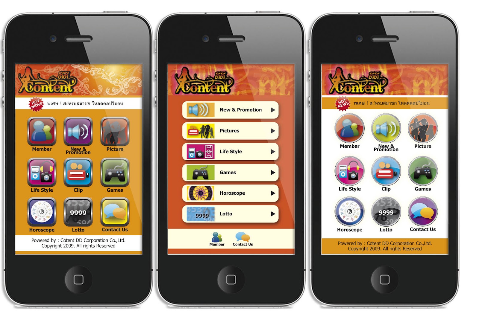
ถ้าเจ้าของบทความชอบแบบที่แล้ว ผมก็เสนอแบบใหม่นี้เป็นทางเลือก อันนี้เป้นตัวอยางงานออกแบบที่ทำให้ลูกค้า ผมเรียกว่าแบบ Icon view เนื่องจากเรารู้ว่ามือถ รุ่นเล็กสุดที่สามารถเล่น WAP ได้คือกว้าง 176, 240 ,320 ตามลำดับ ก่อนที่จะกระโดดมาเป็นหน้าจอ แบบ smartphone ในปัจจุบันซึ่งมรความฉลาดมากกว่า การออกแบบ iconที่เรียงกันอยู๋เราต้องคำนึงถึงการเรีบยงกันด้วย เมื่อพื้นที่ทางกว้างไม่พอ iconจะถูกตัดออกมาอีกบันทัดหนึ่ง เราก็สามารถคำนวนขนาดของ icon ได้ล่วงหน้า เพราะว่าหน้าจอทั้ง 3 ขนาดผมว่าครอบคลุมหมดแล้ว แล้วเราก็ชิงเว้นบรรทัดได้ก่อน ทำให้ User interface เราเป็นไปอย่างใกล้เคียงที่เราออกแบบไว้
ส่วนข้อเสนออีกอย่างหนึ่งที่ผมจะแนะนำคือสร้าง Code detect UI ด้วย เพื่อกรองและจัดรูปแบบหน้าWAP ให้เหมาะสมกับหน้าจอมือถือแต่ละรุ่นที่เข้ามา
ส่วนด้านล่างนี้เป็นข้อมูลที่ผมเอามาจากเวบ http://webdesignerwall.com/
Mobile Navigation with jQuery (view demo)
This tutorial shows you how to create a mobile navigation with jQuery as seen on the sites listed above. jQuery will be used to prepend the menu icon and toggle the navigation. This trick doesn't require any extra/un-semantic HTML tags.
HTML
Below is the sample navigation HTML used in this tutorial:
<nav id="nav-wrap">

 <ul id="nav">
  <li><a href="#">Button</a></li>
  <li><a href="#">Button</a></li>
 </ul>

</nav>
jQuery Code
Include a copy of jQuery and the function below in between the <head> tag. The function will prepend the <div id="menu-icon"> in the <nav id="#nav-wrap"> tag. When the #menu-icon element is clicked, it will slide down the navigation.
<script type="text/javascript" src="http://ajax.googleapis.com/ajax/libs/jquery/1.7/jquery.min.js"></script>

<script type="text/javascript">
jQuery(document).ready(function($){

 /* prepend menu icon */
 $('#nav-wrap').prepend('<div id="menu-icon">Menu</div>');

 /* toggle nav */
 $("#menu-icon").on("click", function(){
  $("#nav").slideToggle();
  $(this).toggleClass("active");
 });

});
</script>
It will render the HTML code like this (you need to Inspect Element or view generated source code to see this):
<nav id="nav-wrap">

 <div id="menu-icon">Menu</div>

 <ul id="nav">
  <li><a href="#">Button</a></li>
  <li><a href="#">Button</a></li>
 </ul>

</nav>
CSS
I'm not going to explain every detail of the CSS code because it is pretty straight forward. Instead, I will talk about the key parts.
The #menu-icon is set to display:none initially. I used media query to change the #menu-icon to display:block if the viewport width is smaller than 600px.

In the media query, I set the navigation to display:none so it is hidden initially on mobile. When the #menu-icon is clicked, it will toggle the navigation as specified in the jQuery function at the above step.
Final Demo
To see the final mobile navigation, view the demo and narrow your browser window or check with your mobile phone.


0 Comments
You can share any idea here.......